Feature Update – Sales Graphs
We’re very proud to bring you a real game changing feature today!
The Sales Graphs are presented much like the vacancy graph you already know and love. Using our comprehensive range of filters you can drill down into any specific sub-set of your data. The Sales Graph then allows you to view and analyse that information in a matter of seconds to glean key insights into your business performance.
By monitoring these metrics, you can maximize the effectiveness of your resources – With the backing of your own data, you can make decisions with more certainty and confidence, leading to a healthier business and an accelerated growth rate.
We’ve put together this short video to show you how it works!
Or you can follow the steps below:
1.
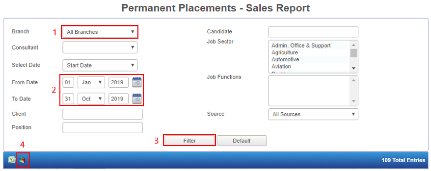
Using your filters, gather the data set which you would like to pull into the graph.
e.g. To examine the entire company’s sales performance for the year thus far, select ‘All Branches’ and use the date picker to select the time span, then click on filter.
2.
Click the graph icon in the top left corner (Next to your Excel icon).
3.
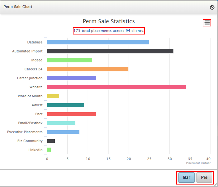
The graph will display the following information:
- Total number of placements
- Total number of clients
- Number of placements per advertising source
4.
The buttons at the bottom of the graph allow you to view the info in either a pie or bar graph.
The menu icon in the top right corner will give you a list of download options to save the image for future reference and comparison purposes.
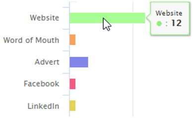
Hover your mouse over the bar or pie segment to view the number of placements which came from that particular advertising source.
At Placement Partner, we’re passionate about finding ways to help you work smarter, so that you don’t need to work so hard!
Chat to your friendly Account Manager for tips and advice on how to filter and use these reporting tools to their full potential.
Let us know what you think of this new feature and keep an eye out for another batch of fixes and updates coming soon!